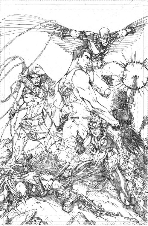
First one has Tim sporting his cowl.

Second, has Bart without hair;)
You'll also notice no SB tattoo, since it was originally on the other shoulder.
I have nothing else new I can post yet so I thought you might like to see some variations of the approved art;)
Best!
Brett
44 comments:
It's so exciting to see these! I can't wait to be able to read this.
The Cowl TOTALLY makes Tim look gay
and the second with Bart's hair covered makes his head too shiny and smooth which makes me think gay as well ;) ;)
Hey Brett!
Thank you for the art you posted, it is beautiful :-) although I have to say, I like Tim definitly whitout cowl (thank you for removing this cowl, really) and Bart with hair better. ;-)
Werwoelfchen
Brett, I'm very disappointed in this man....totally. Completely. j/k :P
There's no Raven dood. :D
Work looks great, as usual, though i think I like Bart with the cap on...makes him look more "flash" like.
Definitely made the right choices there. The skull caps made both of them look much older. And Bart's hair is one of his most defining features.
I prefer them without the cowls.
Plus, I think that showing the hair, especially with Kid Flash, allows for a few 'tricks' to show his speed, such as the hair flowing backwards, forwards, sideways etc with the speed,and with Tim Drake, it helps to show him flying, and gliding in the air.
Thanks for these Brett. Good to see the process.
You seem like one of the more approachable people in comicdom.
Take Care.
I want to see Bart's hair and robin with the mask. The cowl thing just doesn't work for their personality types
Steve
Definitely good choices. I never liked Red Robin's cowl, I think cowls look kind of stupid unless they have some sort of accent to them, like Batman's "ears". I still think you should take a look at some of the fan-edited versions without any of the orange bandoleers either, they really look much much better.
Bart does look better with the hair showing, his hair is practically its own character, like Starfire's, although the shape of the mask still makes it look like some kind of faux-hawk thing.
Thanks Yellow_umbrella:)
Fatboy,
LOL! Totally!
Lee,
I myself prefer the cowl with the cape, but with the 'wings' the mask looks better. I still prefer Bart with the 'skull cap'. Sure it makes him look older but that's just my preference;)
M.O.R.,
I try to be, but right now I have to limit my computer time, I had no idea people would get so pissy about the costumes!
Steve,
Tim's had the cowl for a few years so it does sort of fit him, but he needs a cape to pull it off;)
Oni,
You seem to not get that others might have different opinions than you do. I LIKE the bandoleers, its where he keeps some of his bat/robin stuff. Like smoke caps, ect. Without them he's look bare. An frankly simple and basic, unfinished. Why change it if I like it? As do others, it's almost the same as the one he currently has.
Starfire's hair , at least the old version from the 80's, well I never liked it. Nor did I like Bart's Impulse hair.
Best,
Brett
Love seeing the process, those pencils are beautiful.
Yeah, he does have the bandoleers in the current costume, but I've always felt that the original Red Robin (R)(Yuuum) costume was one of the most horrible costumes worn by a Bat character in recent memory, that almost nothing about it ever worked, and that Tim has always had to fight uphill for any sort of credibility ever since he lost the Robin name and costume.
They dialed it back a bit halfway through the run, removing the little "shirt tails" and such, but the bandoleers remained. All a Batman needs is a good solid belt. Nightwing tends to get by without even that. If the argument is that he needs more gear than Batman, give him a fanny-pack. In any case, the orange accents clash with the red and black, maybe at least make them more yellow. Marcus To did the best version of a "Red Robin(R)(yuuum)" costume during the "Unternet" arc, shown here: http://28.media.tumblr.com/tumblr_lidc6hrdrQ1qbf4zfo1_500.png It combines Robin elements with Batman elements and Nightwing elements in a classy and clean manner. It doesn't overcomplicate things and the balance of black and red works well together. I mean, obviously it's your call, but I, and a lot of other people on other boards, seem to not be a big fan of the bandoleers.
I would also agree that I'm not a fan of Starfire's hair, but like Bart's it is a part of her character's iconography (one might also reference Superman's spitcurl or Reed Richards' white streaks). You can change those things, but it makes them almost unrecognizable, and it does tend to lead to a lot of confusion. When that pic first hit the Internet, there was a lot of discussion as to whether it was Wally or Bart, because it looked very much like a young, rebooted Wally. If he'd had the big feet, and the big, brown hair, there would have been no confusion at all. Those are the visual iconography of Bart Allen, he has golden eyes, big brown hair, and big stompy feet. Ideally he also has a maroon and cream color scheme, but for the past few years we've had to settle for ketchup and mustard because that's what Wally used to go around in.
Also, blogspot is awesome because the captcha word it gave me this time was "winge". ;)
Oni,
You're not hearing me.
Just because you like that costume, doesn't make it good, it just means you like it. To me it's FAR too close to Nightwing's and doesn't show enough Robin. If Tim takes over for Dick, that costume would work fine, but that's not the case at this point.
Tim likes things, tech things, he need places to store them along with the normal Bat supplies. Tim is always prepared. So he needs a few more belts and pockets. So to make him retain his Timness, I kept parts of his current costume, added a few things but it still retains it's Timness.
I hated the big feet, BUT those are not parts of Bart character, those are reflections of Humberto Ramos' art. Bart's characters is who he is, not what he looks like. Impulsive, funny, loyal. Those are his character traits, hair can be cut, shoes can be changed and hell, you can change eye color with some contacts, but that doesn't change who he is, just what he looks like.
Bart had auburn hair so it's more reddish than brown. His color scheme is KID FLASH's. When he took the name he also took the costume and the colors. You're doing it again. YOU want him to be exactly how you want him, no changes, no new nothing. Characters stagnate and die when you do that, which is why TT needed a reworking. The book lost it way and had no actual purpose other than Teens fighting whatever they stumbled across. Which is fine every now and then, but not for a series. Scott's given the book a purpose outside random bad guy fights. Yes you liked the current run, but most of the comic fandom didn't. Will this new version work better for them? Who knows. Change CAN be good. Evolve or die.
So if things aren't the way you want and you aren't going to pick up the series, why not write some Fan Fiction that you like? You aren't going to change my mind (not that that's an issue as I don't make the final decisions so I can't really make changes.)
Best,
Brett
@Brett
I've always wondered how do you make variations? do you re-draw?
Somehow Bart looks kind of creepy to me without the hair. Probably the effect would be different in color. Or if he ever decides to turn evil....
Has there ever been a Kid Flash suit that didn't have his hair loose? Seems like it implies the wildness of a younger character.
I do think the final designs worked out better, but it is fun to see what was considered. Too bad we don't see writer's notes from similar steps in the process.
Brett, I'm not saying you have to agree with me, your position is your position and mine is mine, and since you're the artist on the book, yours obviously carries a lot more weight. ;) I'm just saying what I don't like about it, and on a few other places I've seen similar comments, that the orange bandoleers is one of the features of the costume that is not as popular as others. I haven't really heard anyone actually being in favor of them.
It's worth noting that Red Robin's costume was Dick's well before it was Tim's, so attempts to make the current Red Robin costume riff off of the old Red Robin costume would be no more "Tim" than to riff off of Dick's Nightwing costume. If you wanted "Tim" elements then I would suggest borrowing more from his classic Robin look, like adding some green in there (never orange), or yellow to the cape lining, or bringing back the stylized "R" logo instead of the "bird head" logo.
As to Bart, yes, Ramos started the big feet thing because that's just how he rolls, but various other artists (at least up through the cancellation of Impulse) kept that trait in for the character, maybe not as big, but a few sizes above average. I think it helped to set him apart from the other speedsters.
That's one problem the Flash family has struggled with, that in costume it's hard to tell Barry Flash from Wally Flash from Bart Flash, so I really like things that are completely different about them, like Bart's got brown hair (you could argue "auburn" but it's definitely on the mahogany end, never ginger or chestnut) where Wally's is red and Barry's is blond, or that Bart is more wiry with big feet while the other two are more muscled, and Bart can have his cream/maroon colors where the others are red and yellow.
Yes, personality comes through, but that takes time, it takes pages to tell one character from another via personality, especially when you're rebooting things and nothing can be taken for granted (it's hard to tell, for example, that the characters in the YJ cartoon are NOT Tim and Bart until they actually say as much, as they are composites of those two with Dick and Wally). So yes, you can define the character through personality, and should, but it doesn't hurt to also define them through iconographic elements, like Cassie's "W" iconography on her various costumes. That way, it doesn't take pages to establish, a single snapshot of the character says "oh, that's so and so."
As for the change from Impulse to Kid Flash, I, like many people, felt that was a step backwards, because he was his own, unique hero with his own name and costume, and he was backsliding into a subordinate role, taking on the name and costume of another character. It'd be like if you, at whatever age you're at, suddenly gave up being a comic artist and became whatever your dad is, and took his name as a "jr." No harm in taking that path from the start, but if you've already established your own identity, there's nothing to be gained in just duping someone else's.
It's not that he couldn't change over time, I just wish that he'd been allowed to change as Impulse, to evolve and define that role into adulthood, as various "flash forward" issues did during the run of Impulse, showing a future Bart that was different, evolved, but still Bart.
I have a feeling that a lot of the stuff Scott plans to do with the book moving forward will be great, and I wish I could follow into it, but I just wish that he could have started the path he's going to take from the path that Krul left for him, use Titans #100 as the "#-1" for the story he wanted to tell and build on that foundation, rather than scrapping whatever elements of the past he didn't like and starting from scratch. I have no problem with direction, I have no problem with good storytelling, I just have a problem with discarding all the stories I've already enjoyed.
If you don't find my criticisms helpful, that's fine, you don't need to consider them, or even read them, but I feel I should make my case anyways, it's the only thing I can do.
Oni,
I've heard the opposite, only a few complaining. And the bandoleers are the Timmest part of his costume as none of the other Robins or even Batman have them. That's it unique to Tim. I liked them, they remind me of Tim.
Robin is a position, not a single person, like Kid Flash, or Flash or Batman. Bart is the grandson of Barry it's his destiny to take over as the Flash.
And if you didn't know that was Wally on YJ for shame! Large quantities of food and hittin' on girls has always been his thing!
Best,
Brett
As I said though, the bandoleers were originally Dick's, not Tim's, and was then worn by Jason before Tim as well. http://media.comicvine.com/uploads/2/23199/462604-200px_red_robin_kingdon_come_super.jpg
Nothing about Tim as Red Robin was uniquely "Tim", the entire concept was a hand-me-down. It's be like saying that because Dick was just recently Batman that having a pointy-eared cowl is "uniquely Dick".
Like I said, if you wanted to go with something uniquely "Tim," go with the elements HE brought to the game, like the stylized "R" logo (which was different than the one previous and subsequent Robins used), or the black and yellow cape (the previous ones having all yellow capes and the current one having a hood), or the use of green in the costume. And of course the staff, as long as he's got the staff you know it's Tim under there. And while an "R" logo can work just as well for a Red Robin as for a "not Red" one, if you felt it necessary you could overlap two of them like a shadow or something. ;)
And yeah, about the YJ Wally, it became apparent over the course of the episode that it was probably Wally (or a very "Wallified" Bart, as the Robin is a very "Timified" Dick), but the immediate impression, just from the initial shots, was not immediately obvious. That's what I mean about visual iconography, they shouldn't have to talk, they shouldn't have to act, just by looking at a single frame you should be able to identify certain visual touches that are unique to the person under the mask.
You just show a random due with red hair and a ketchup and mustard costume, that's Wally West as Kid Flash, visually. He may not act like Wally, but the visual impression is that it's wally. You make his hair dark and wild, you make the feet noticeably larger than average, you make the colors more towards cream and maroon than condiment tones, the more of those elements you add, the more the character is obviously not Wally, just at a glance.
New Justice League America 58 cover and preview on Newsarama!
http://www.newsarama.com/php/multimedia/album_view.php?gid=3353&page=1
Unfortunately I don't think Brett pencilled any of the interior
Brett, Oni,
Sorry if I interrupt your discussion but I have to say I also think the added belts/bandoleers are very useful for Timothy, because like Brett, said, he needs them for his many devices and bat supplies. Tim needs more devices and other things to go against the villains than other members of the batfamily, because he will never be as strong in fighting and in material arts like the other bat family members and he knows that and I think it does not matter to him. He knows that Bruce, Jason, Dick and even Damian are more skilled in fighting and stronger than him, but he is the smart one and he uses that to his advantage to go against the villains and that trait of his personality I like the most beside his geekyness, because it was always easier for me to relate to Timothy, who is not so strong than the others like Jason, Dick etc. but he uses his mind and not pure force and wins nevertheless against the bad guys and that is I think a wonderful message for the kids, or even adults out there who read comics. So now I am babbling to much. At the end I only want to say that the more belts are necessary for Tim in my opinion because without them he would not have an advantage against his enemies.
Sorry for interrupting your discussion again and keep in your mind that what I wrote was only my opinion. ^_________-
I wish you a nice day.
Werwoelfchen
P.S: I like the word Timness yeah :-)
I get what you're saying Werwoelfchen, but Batman's always been about the gadgets too, the utility belt is a magical thing, it has plenty of room for however many gadgets are needed, no matter how little space it appears to possess. ;) Besides, the bandoleer just has a bunch of lipstick capsules on it, so it's not like it can carry a ton of stuff, maybe a few extra pounds of very tiny gear, like portable flashlights and a few matches or something.
Really, given how light the pouches on his current belt are, he could probably carry twice as much gear by dropping the bandoleer and just switching to a belt with bigger pouches, like so: http://www.petpeoplesplace.com/petstore/pet-image-large/batman-no-mans-land-vol-3-tpb-rare-oop-mint_370505750780.jpg
At the very least maybe they could be made black instead of orange, the orange clashing with the red and black is the worst part of them.
Also, don't discount Tim's skills, he was trained by Shiva (and beat her) and has fought off tons of martial arts enemies without relying on any more gear than Batman would use to do it. He does use his brains more than his brawn, he plans ahead more and thinks well on his feet, but that involves situational awareness more than it does what's in his pockets. Tim without any utility belt is as much a threat as any other Bat character, he'd just do it by using the environment against his opponent.
Really, if any Bat character is gear-reliant it'd be Steph, since she's not nearly as smart or combat skilled as any of the others.
Oni,
I would say Steph is more capable than you're giving her credit for, however that is an entirely different discussion for somewhere Batgirl related. As to Tim's new look. I've made it clear both here and other places that I'm not a fan of what's being done with this book based on my initial impressions, but this is Brett's blog and he has laid ground rules regarding the criticism of the redesigns, so I will respect that and to be fair given the enthusiasm of his writer Scott for this project give the stories in September a chance to win me over. It wouldn't be fair for me to write off an entire project based on a couple interviews, one rough promo image, and one cover.
Yeah, like I said, I'm not saying that the new book won't be any good, it's far too early to make a judgment like that, but there are plenty of good things in the world that I don't have time or money to get into, so if I miss out on one good comic, it won't be the only good comic I miss out on.
I'm not passing on the book because I don't think it'll be any good, but rather because I think it's an insult to people that enjoyed what these characters were before, that it can't continue from where the book left off, in whatever direction they care to go from there, and must instead scrap various elements that don't suit their personal tastes and start largely from scratch.
When fall comes around, I'll have plenty of good books to choose from, and I'll go with the good books that don't disrespect decades of continuity and the fans that enjoyed them.
But that's neither here nor there.
"When fall comes around, I'll have plenty of good books to choose from, and I'll go with the good books that don't disrespect decades of continuity and the fans that enjoyed them.
But that's neither here nor there. "
Then why are you here? Are you so arrogant that you think your opinion matters above all the others including the people who actually OWN the character? And why should I listen to you if you aren't going to pick up the book in the first place?
You haven't read the book, but you already accusing people of disrespecting it, you know what? Fuck off. You have no idea what went on, no idea the fights I got into with Scott over these costumes, how I wanted to simply modify them slightly but Scott wanted to make major changes. We met in the middle. You don't know anything, yet you come here and bitch, and bitch and whine and complain, well go somewhere else because if you're not going to read it I don't have to listen to you.
Brett
Hey brett,i love you man.
Cant wait for september
I really really liked the cowl, it really separated Tim from Dick and Damien, and I think it makes the wings on the costume look a lot better. Just my personal preference.
Hey,
Looking forward to Teen Titans. The promo and cover look great. (I'm happy you went with Bart's hair out). Keep up the good work.
Thanks Tony! I was worried I'd get hate mail cause I'm mean;)
hallda01,
I sort of liked the cowl myself, but I was vetoed;)
Mark,
Thanks!
Best!
Brett
If we as fans can be as nasty or annoying as we can be,you should be allowed to,not to mention this is your site,you should be allowed to say or do whatever you want on it.only exception would be if you were worried about your job,but thats it.
Now bring on the promo art or teasers lol.
I want New revamp superboy now
Brett,
Man after reading all that stuff with Oni I am a even BIGGER fan of yours, way to stick it to the haters! I know you tried you best to do the best you can with the costumes, and I think you did a GREAT job, I think these are good costumes and great art, I know you will do a super job on all the art for these series and that DC left the art in good hands. Can't wait to pick this up!!!!
-Dylan
I hope we continue to see the character Tim grew into over in Red Robin, the one Batman tapped as the next leader of the Outsiders over in Bat Inc. It feels like Tim has gone beyond the TT but I'll have to see how Scott and Brett tie it all together. With any luck they do well TT picks up and Tim can get back to doing his own thing. I've already seen him interact with Conner, Bart, and Cassie so it'll be interesting to see how the creators make that fresh when so many interactions between the four already exist in prior volumes.
Tony,
Yeah, some people have no manners. Bitch at me all you want on other sites, but you come here and do it and expect me to be nice, not going to happen. I even asked DC if I could draw a 'special' image for Oni but they didn't want me to to;)
I just saw the first colored Superboy image form TT1, fricken cool!!! I can't show it though:( They have started releasing a few things here and there so hopefully soon!
Dylan,
Thank you. I wanted more traditional one at first, before the whole reboot, not a reboot thing. Scott had actually done a script that I was just about to start drawing when they decided on re... tooling? SO with the new script new costumes to reflect the new direction. What Oni seemed to not understand is that his/her Titans were going to be cancelled. So if this one flops there will be no TT book. It won't get brought back to what he/she wants with those sales numbers.
Robert,
That's the plan, Tim is the real star of the book.
Trust me these will be all new interactions, since this will be the first time they meet in the DCNu.
Best!
Brett
Brett,
Ya I understand that, to tell the truth I only started reading TT like a few months before the reboot and I really did not care for it for some reason, but when I saw this for the first time, I REALLY wanted to read it then. So I hope it sells well and does not get canceled haha, but we shall see.
-Dylan
Do I understand correctly that you and Lobdell were both going to be doing the current Teen Titans, and then the "re" thing came about? If so, it's too bad you didn't draw a few panels of the current crew, so we could see the side-by-side comparisons of your take on the old and the new. The nU?
I guess from the way this is going to be set up, there won't be any multiversal meetings of the two teams face to face. But it would be hilarious to see the Titans of Tomorrow come back and wonder who the heck these new kids are.
Dylan,
I'm hoping he new TT will be more to your liking:)
heffison,
I was literally starting to do layout when Scott told me to stop. But I will be doing a TT pinup for issue 100 with the guys of the current run, along with a few others;)
Best!
Brett
Brett,
I have the need to apologize for the behavior of other fans in the dc fandom, I only want to say I hope you know the rest of us is really excited about the new Teen Titans after the reboot and that the most of us are not against change because changes can be good and make things better.
I wish you a nice day.
Werwoelfchen
So brett how far in advance are you right now on teen titans? Ive heard some say every book needs to be three months in the can already,i was wondering if that was true,and how far you are?
With all the people bitching about the revamp,and all the people excited you would think DC would be flooding the net with pics,promos,and interviews for these books and characters,even if it is months in advance.i mean sure surprises are great,but knowing what your gonna get,or what to get is nice to.
Btw what is with donna troy getting impaled?
No need Werwoefchen, only a few sour grapes here. I just wonder why they thought the thinly veiled insults would go over my head:/
But we did take your advise and the outside of Tim's /wings/ are not black:) So thank you!
Tony,
I'm just a bit past the halfway point for issue 2. Should finish in a week and a half. I tend to start a bit slow and finish strong. Right now I'm doing a 2 page spread of Robin fighting a new badguy... 12 panel fight scene (not counting the other pages.) Yes we were told that the first 3 issues must be done... not sure if that's just pencils or totally completed by August 31. I'm actually hoping to be finishing up issue 4 at that point and I hope to be almost done with 5 when 1 ships. I'd like to do the first 12 issue without a fill in.
I think they are a bit overwhelmed with all the titles. I did ask yesterday of I could post some of the rejects costume designs, but they'd already left for the day:(
Best!
Brett
I hope they do let you share some costume designs soon. I've been trying to draw Tim in his new costume, but have held off on completing it for now until I get a better view of the whole thing.
When you say that the outside of his wings is not black, is the outside solid red? Is the inside still black and red the way it is on the cover and preview image?
And one more question if you can answer, is the area just below his belt, the shapes in common with the Young Justice cartoon's Robin, solid red, or just red piping/lines? On the finished cover it looks like red piping/seams making the shape, but on the solicited sketch/promotional drawing those shapes are solid red, as they are in YJ.
Whenever you post any of the designs, or have them used in an interview, or however they show up, I look forward to seeing them a great deal.
Are you by any chance going to be at the San Diego Comicon this year?
Hi Ronnie,
The outside of the wings is black, the inside is black and red.
The cover is wrong, Norm blacked that in by mistake, the preview image is more correct for the pants.
No San Diego con for me. Too many people!
Best,
Brett
hey :-)
Ahh I am really happy that now the outside of Tim's wings are black. That is great. You really made at least one Teen Titans fan very happy today. You truly made my day.
Werwoelfchen
iFanboy had an interesting podcast about the new DC universe. I guess I must really love 90's style art because I don't see it as a bad thing, were as they were probably most critical of your book out of all the relaunches. Why is 80's style art good and 90's bad? If you are a "Jim Lee-clone" and he is the "best" artist at DC why are you not equally revered?
I am so excited for Teen Titans, and I'll go on record (and probably be hated) for saying I imagine much like his Fantastic Four run, at some point Jim Lee will need some fill in work and I so hope Brett gets to do some pages with Scott Williams throwing down the inks.
-Steve
Steve,
I'll have to check it out. The clone thing just shows their ignorance. If I was a clone I would be trying to draw exactly like him. I don't. I like the 90's art, I find the current 80's throwback style bland. I think you'd be shocked to hear that some people don't like Jim's stuff. For me it's the ultimate manly super art, the ultimate expression of the art form. Plus most of them haven't actually seen any of my work since the 90's and they are merely going off a couple of pinups.
I'd like to cross over with JL at some point. I have suggested it, but I'm not sure if I'd like to take on another team book after TT. I would love to work with Geoff and Scott again!
Best,
Brett
Bland is exactly what teen titans and superboy is to me now,and I can't wait for the new restarts,its been driving me crazy having my favorite character superboy in so many books,but coming off like a weak pretty boy wallpaper version of himself,I want actual emotions,I want actual action,I want him to be a badass again,or like we have never seen before.
U keep doing what your doing,and heck with the people who enjoy watered down comics.
Post a Comment